
Kiss art block goodbye.
About Brushies
Designed for digital artists, Brushies delivers monthly digital brush sets, textures, and instructional guides (compatible with certain digital drawing softwares) to promote creative experimentation and mitigate art block. The platform also fosters an online community, promoting collaboration and exposure opportunities for subscribers.
My role
UI Designer,
UX Designer
Tools
Figma,
Flash, HTML
CSS
Timeline
2 months
1. Overview
Problem
Since its November 2024 launch, Brushies has experienced below-target-level conversion rates and elevated bounce rates.
According to research (see more detail in section 2), digital artists have difficulty finding clear information about the platform and its services, as well as a streamlined path to subscription.
Solution
To enhance user navigation, I redesigned the landing and interior pages to centralize product information and clear, accessible calls-to-action.
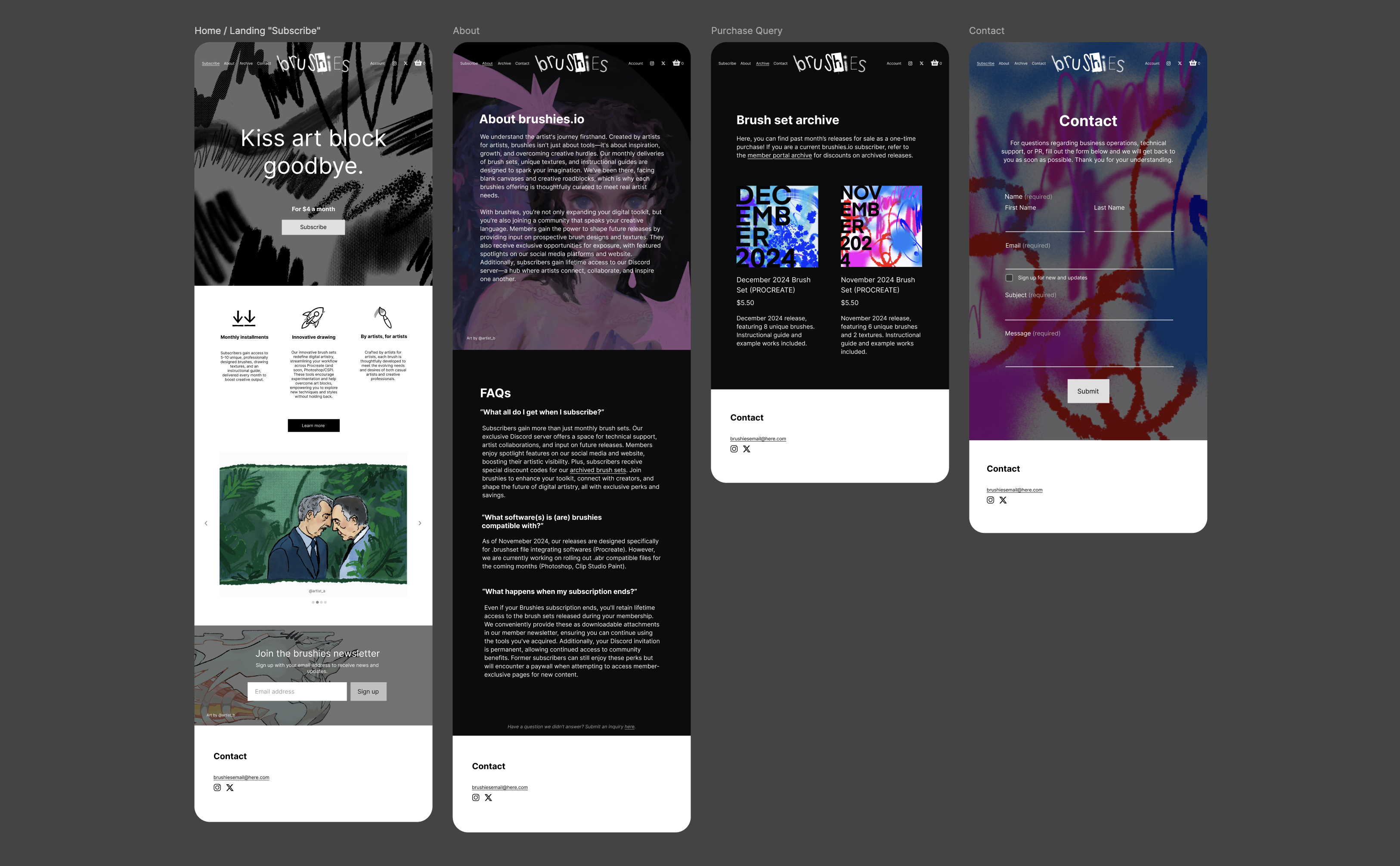
Brushies’ new landing page serves as a centralized hub, guiding users to: A) explore its services and FAQs, B) view examples of work created using its services, and C) seamlessly begin the subscription process. Additionally, the new site features a dedicated user portal, providing subscribers with centralized access to their personalized tools and benefits.
Intuitive
Information is located where users naturally expect to find it
Brushies’ updated pages now include captions, buttons, and graphics in areas where UX research revealed gaps. Information is easy to find, and navigation flows naturally with minimal effort.

Frictionless
Strategic linking across all pages for a seamless user flow
With prominent calls-to-action linking landing and interior pages, users can move through the site more fluidly than ever before. By eliminating site frictions, we can project an improvement to the conversation and bounce rate, all while enhancing the overall user experience.
Organized
Your personal hub—everything you need, all in one place
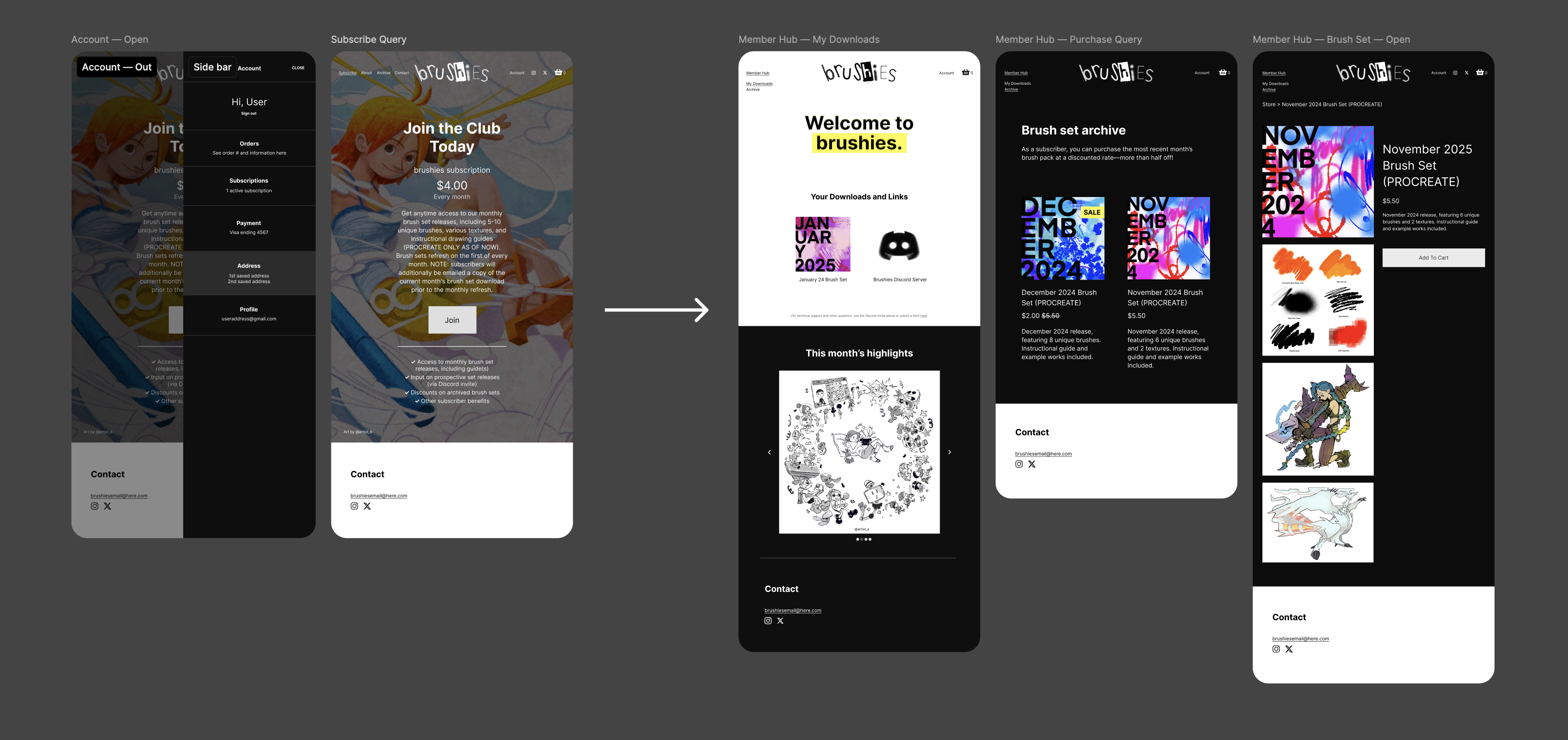
No more digging through email newsletters for embedded downloads—subscribers can now log in to the Brushies website's built-in portal for easy access to their monthly downloads and curated content.
2. Research
User Research
Identifying current pain points and improvement opportunities
In order to promote overall navigation and boost conversion rates, I needed a deeper understanding of the Brushies user base, considering key behaviors for both mobile and desktop visitors.
To achieve this, I conducted interviews with a diverse, representative group of digital artists. To better organize and analyze my findings, I synthesized the data into an affinity diagram using FigJam. Categorizing data this way helped me identify user patterns and pinpoint areas of the site that had significant room for improvement.
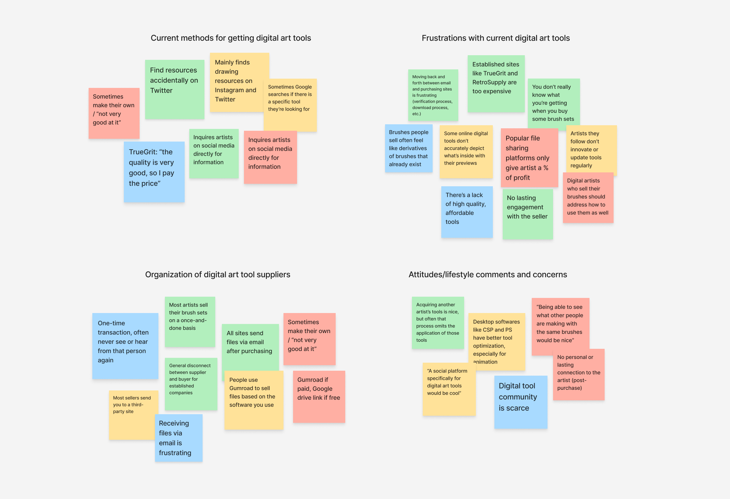
Based on conversations with target users, I learned the following:
*
People like being able to see what they’re subscribing to.
For a visual-centric audience like digital artists, being able to see example works using the digital brushes and textures included in their subscription is crucial.
*
Artists are looking for more than just a one-and-done transaction.
Beyond tools, digital artists are seeking connection, community, and continued engagement with the seller.
*
Most people like having everything they need all in one place.
People who use digital subscription services like being able to access their downloads directly from the site, versus receiving their files via email.
Empathizing to Iterate
Visualizing personas and journey maps to achieve user goals
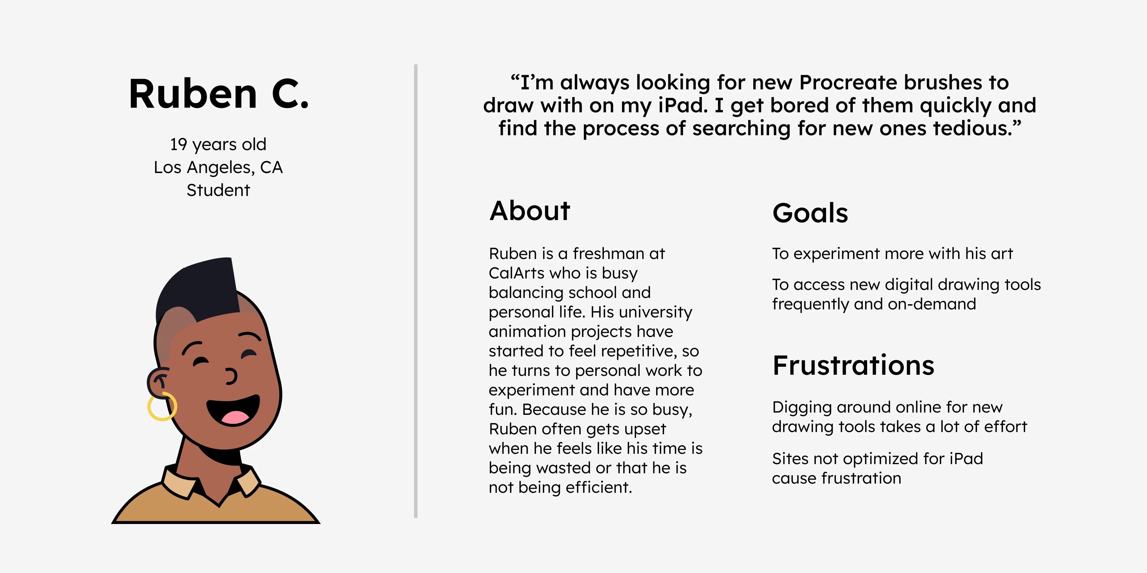
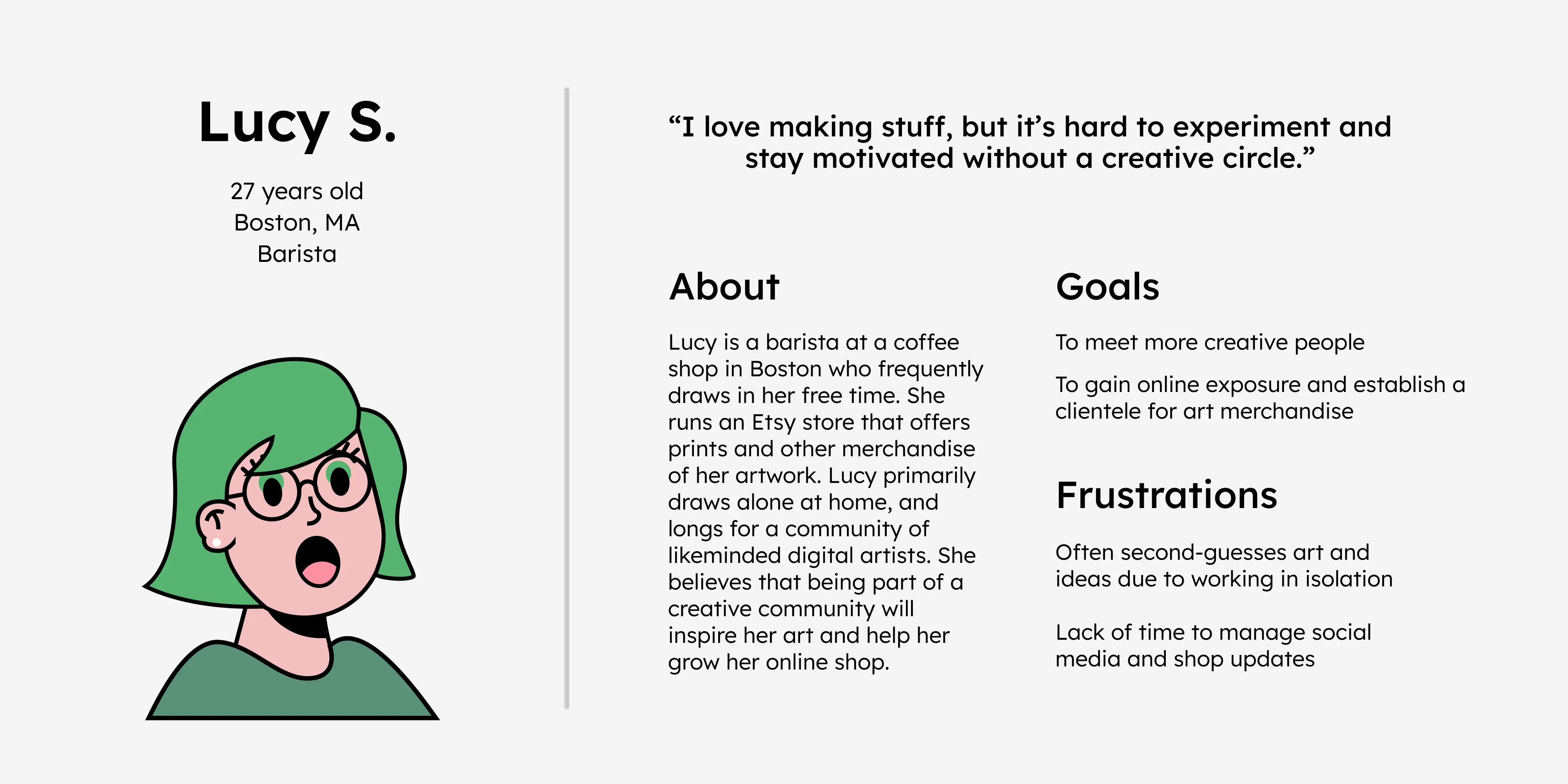
After reviewing my personas—user's goals, behaviors, and pain points—I initiated user testing on the site’s existing structure to identify Brushies-specific usage issues and areas for improvement.
Based on site analytics and persona profiles, I derived the following journey map to visualize how users might move through the site (before observing to them directly).
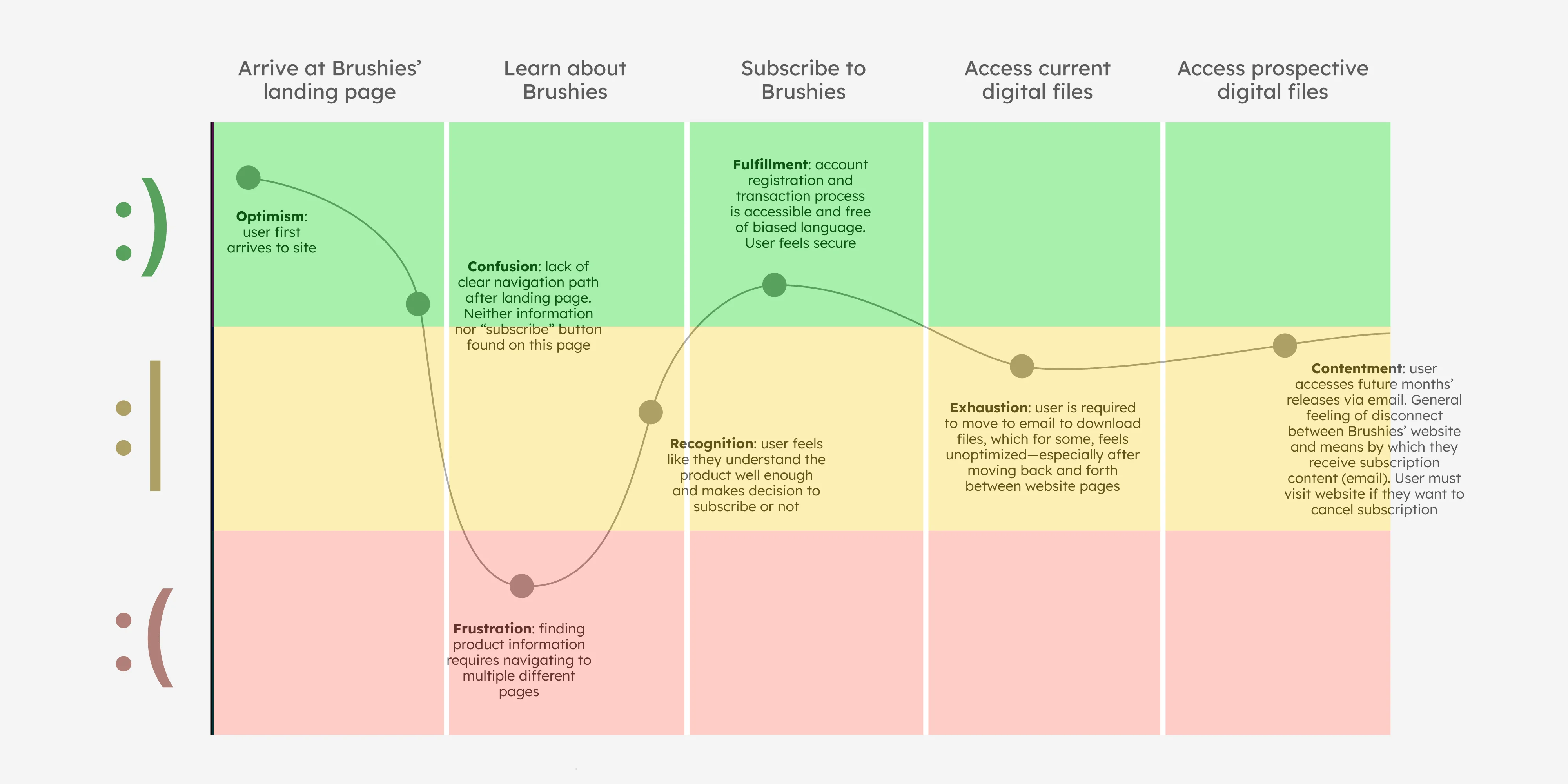
Usability Study
Conducting a moderated usability study to see how users behave and navigate in real time
In this study, I walked participants through a set of navigation tasks, closely observing user flow and site responsiveness.
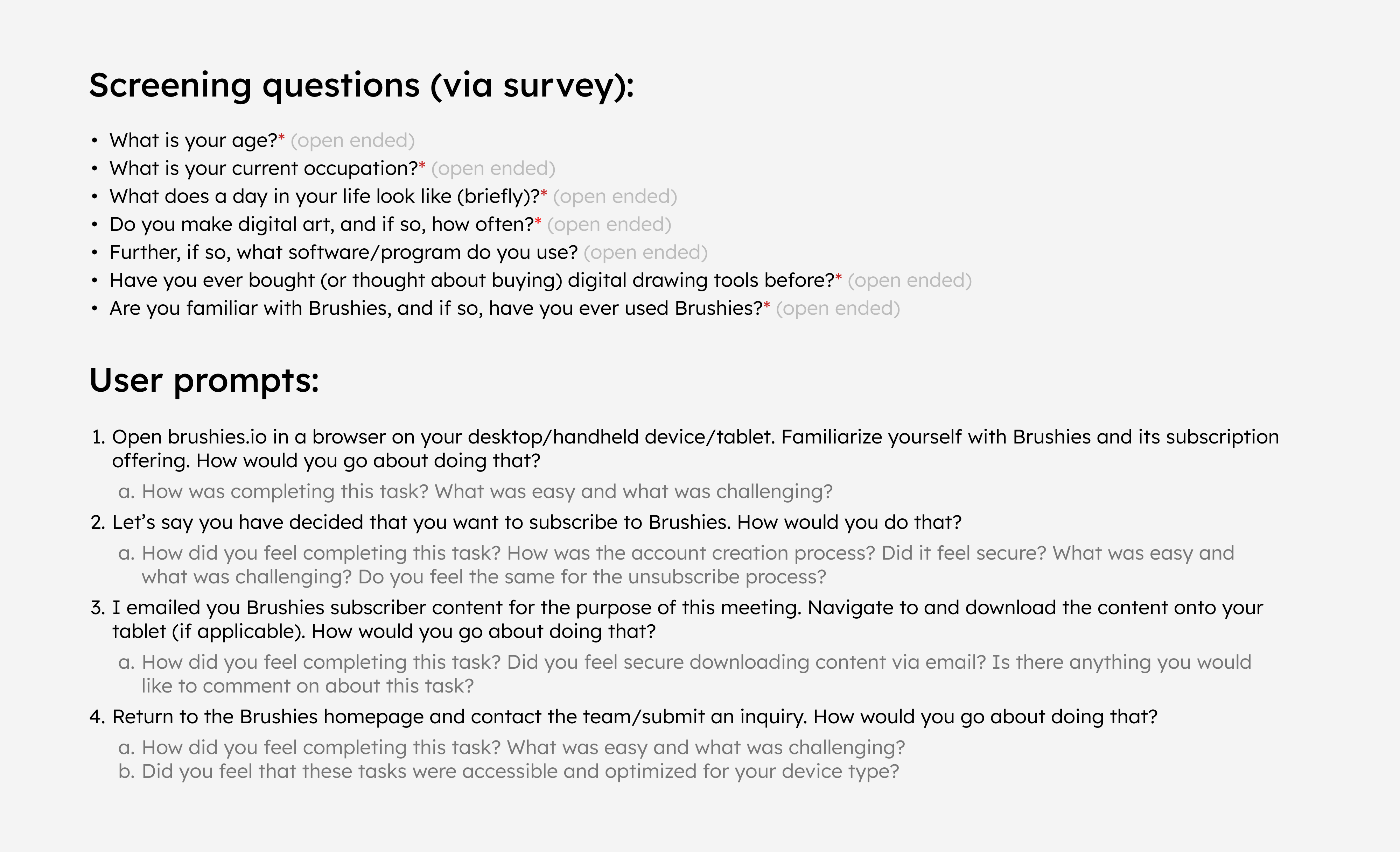
Observed users accessed the site from a variety of different devices, including smartphones and tablets. Additionally, each participant was pulled from a representative sample of prospective digital artist subscribers (see screening questions in image above). After observing their navigation on the current Brushies site, I arrived at the following 5 key takeaways to guide my next iteration of design:
1. The site is unoptimized, specifically for tablets (or devices they intend to use the service on)
2. The landing page layout inhibits users more than it helps them
3. The current means by which a user navigates pages breaks the experience altogether
4. Product information is spread across pages and needs to be consolidated
5. Users want to be able to subscribe and download files without leaving the website
3. Design
Ideation
Research-informed design explorations
After conducting my initial usability study and sharing conversations with prospective subscribers, I began mapping out new versions of the website, focusing on page structure and visual hierarchy. Before heading over to Figma to begin mockups, I organized my design priorities in FigJam to help guide all future iterations of the platform.
Referring back to my usability study takeaways during this phase helped ensure my designs stayed, first, free from personal bias, and second, centered on user needs and accessibility.
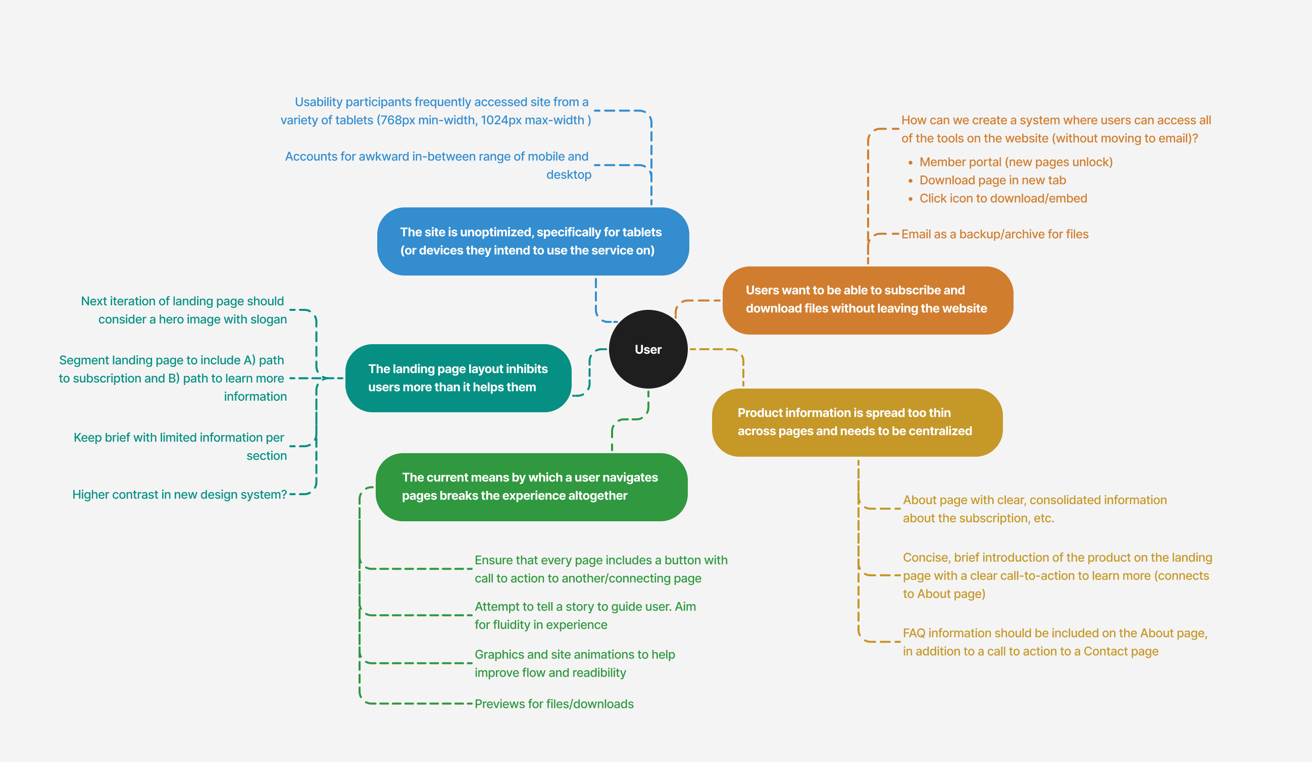
As I moved into the wireframing and mockup phases, I ensured my designs explored some of the key features outlined in the figure above—a built-in subscriber portal, segmented pages with more calls-to-action, and improved responsiveness for tablet devices.
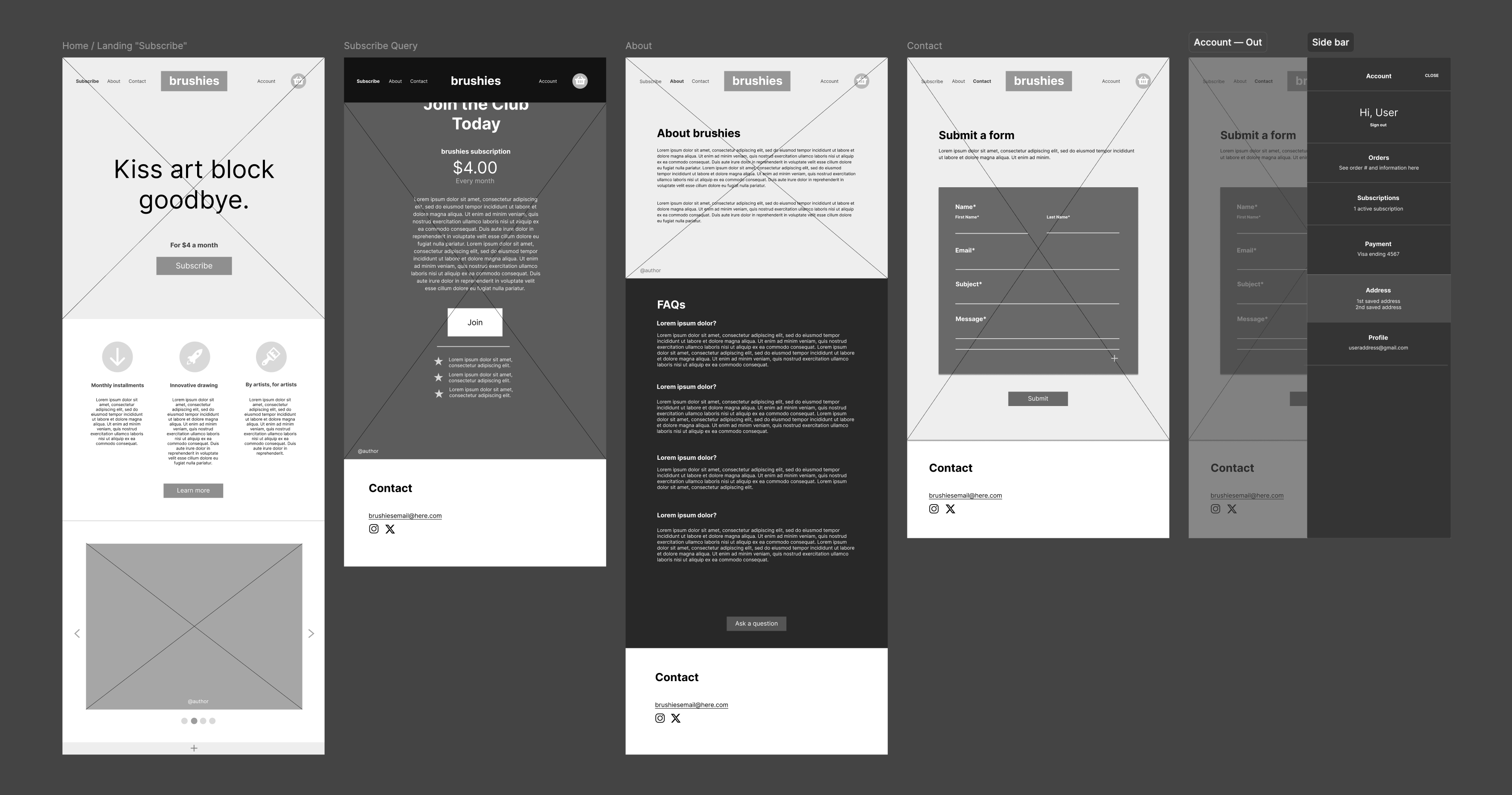
Wireframes and Mockups
Adjusting page structure for improved usability
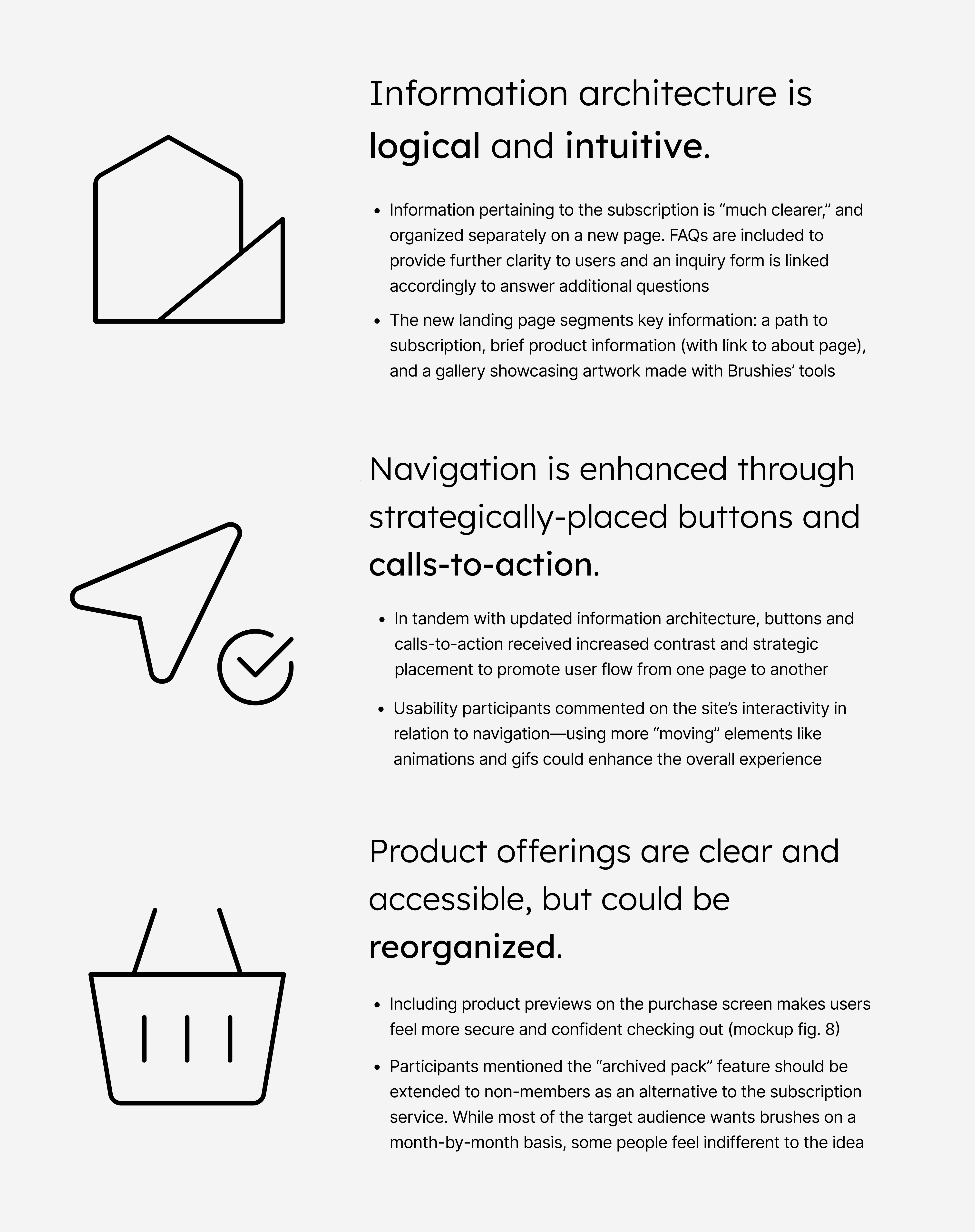
Aligned with my research, the newly drafted pages of the Brushies website feature higher contrast and clearer information hierarchy. A revamped about page now includes FAQs and an invitation to submit inquiries, linking directly to the contact page. Additionally, the site introduces three subscriber-only internal pages, allowing members to download files and access promotions without leaving the site (see second figure).
Note: paper wireframes and desktop mockups not included for brevity.
User Feedback and Iterating
Validating the design: is it actually working for users?
I called back a handful of participants from my usability test, as well as new individuals, to verify that the new design streamlined processes that originally proved to be inefficient. After showcasing my mockup and discussing its viability, I organized my findings into three different categories (see below).
Interestingly, the majority of participants had recommendations beyond just navigation this time around—comments regarding Brushies' digital subscription content and offerings.
High-Fidelity Mockups and Prototyping
Revising the design based on mockup user feedback
Improved pages and navigation
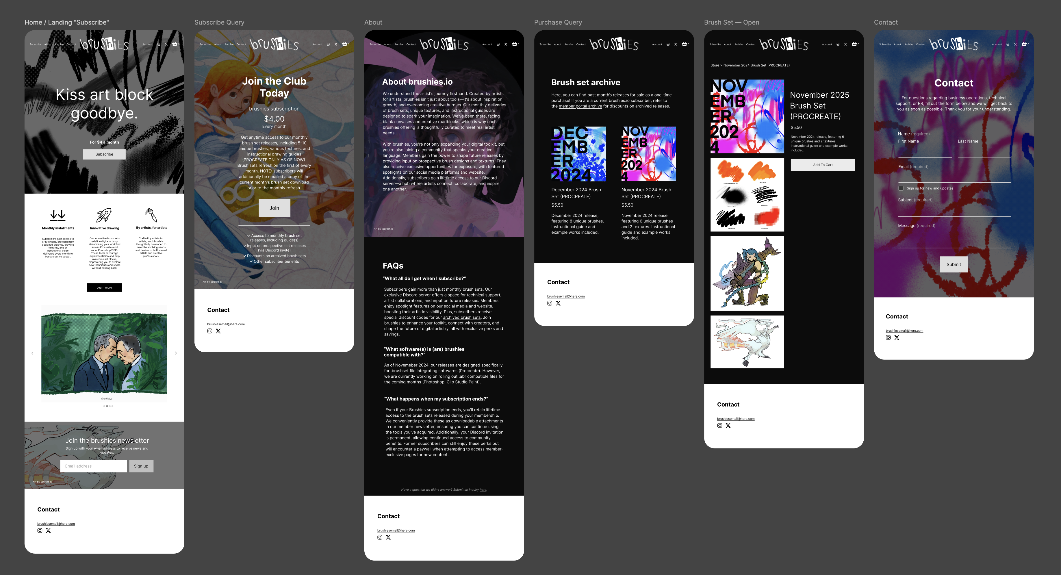
The high-fidelity mockups and prototype support smooth navigation through high-contrast calls-to-action and a clearer visual hierarchy. Animated GIFs (screens 1 and 4 below) are now integreated to enhance interactivity—an improvement directly informed by my usability study findings.
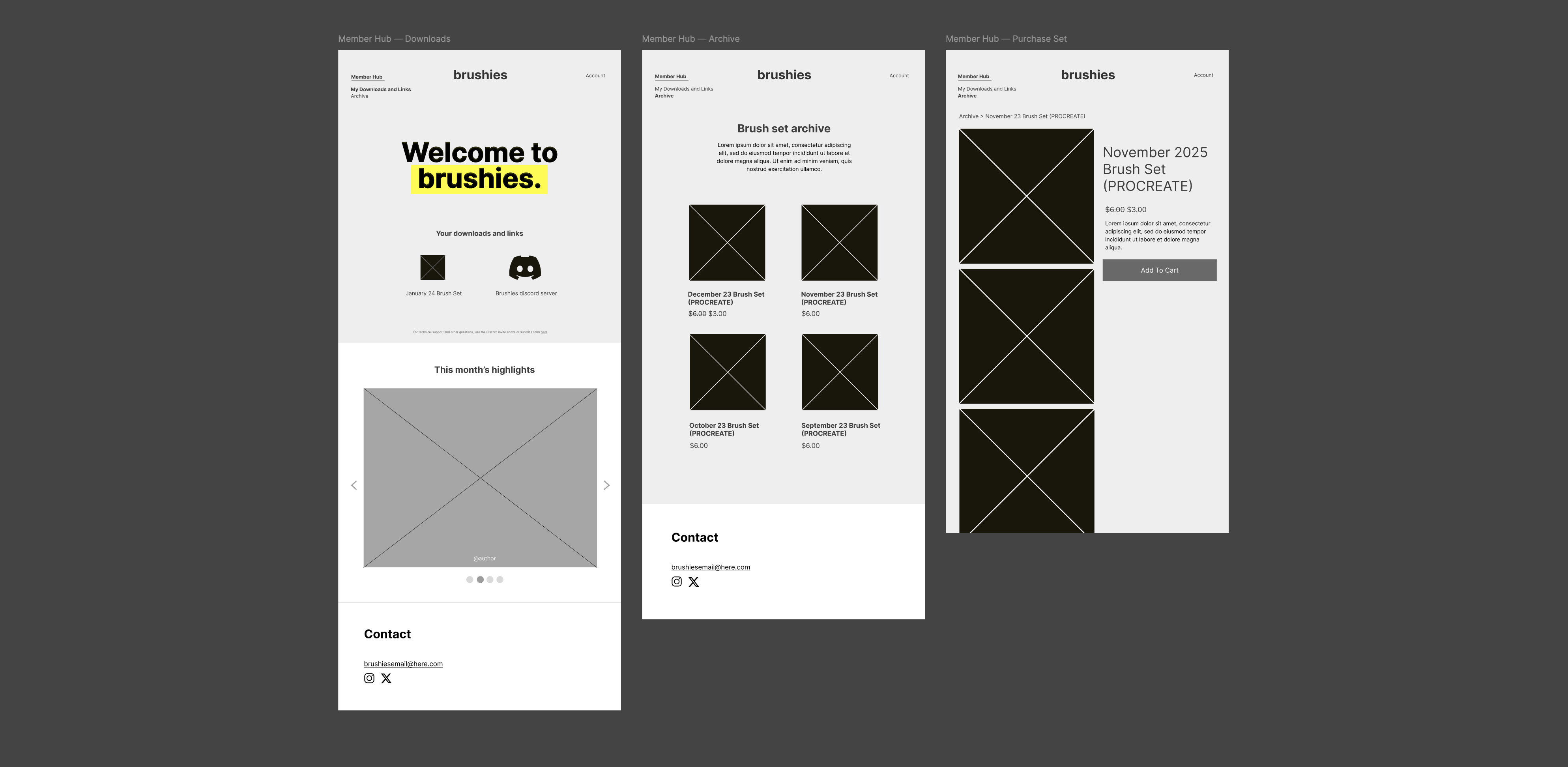
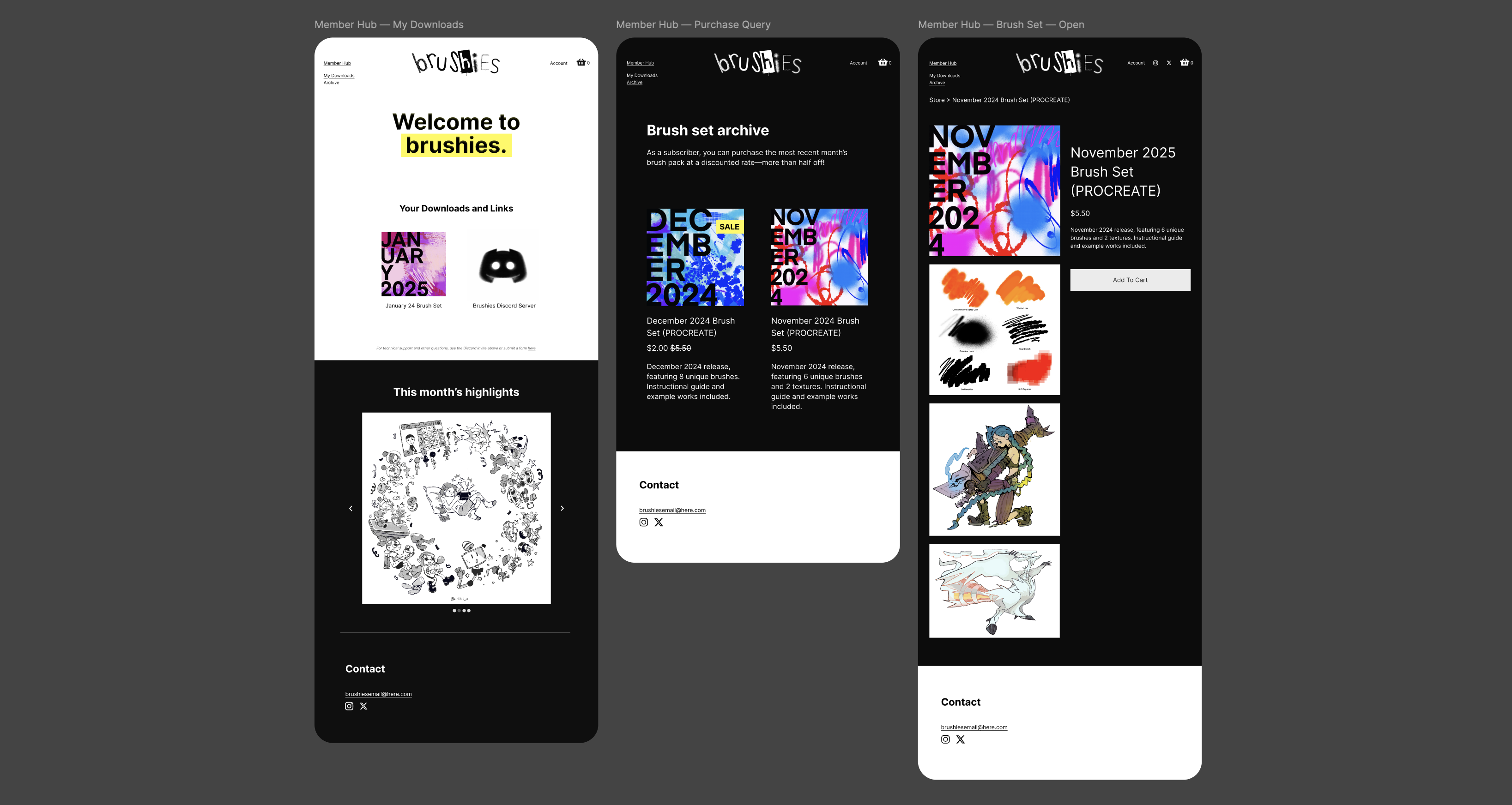
Built-in subscriber portal
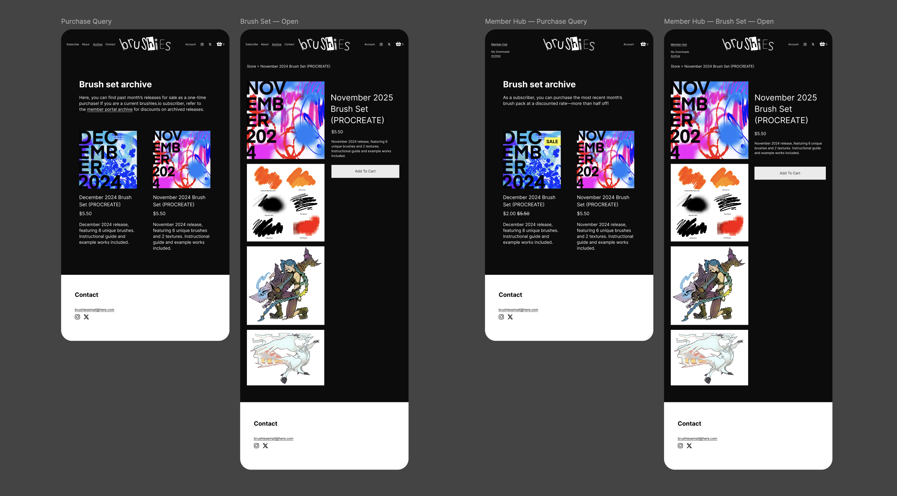
In line with user research findings, Brushies now includes internal pages that become accessible only once a user subscribes. The site matches a subscription ID to an account accordingly to unlock the portal’s three screens. Here, users can access their monthly downloads, join the community Discord server, and purchase archived brush sets at a discounted price.
User-backed product expansion
While originally only available for subscribers to purchase, archived brush sets have been extended to non-subscribers. To incentivize the subscription, Brushies maintains promotions on these sets within the member portal.
Updated design system
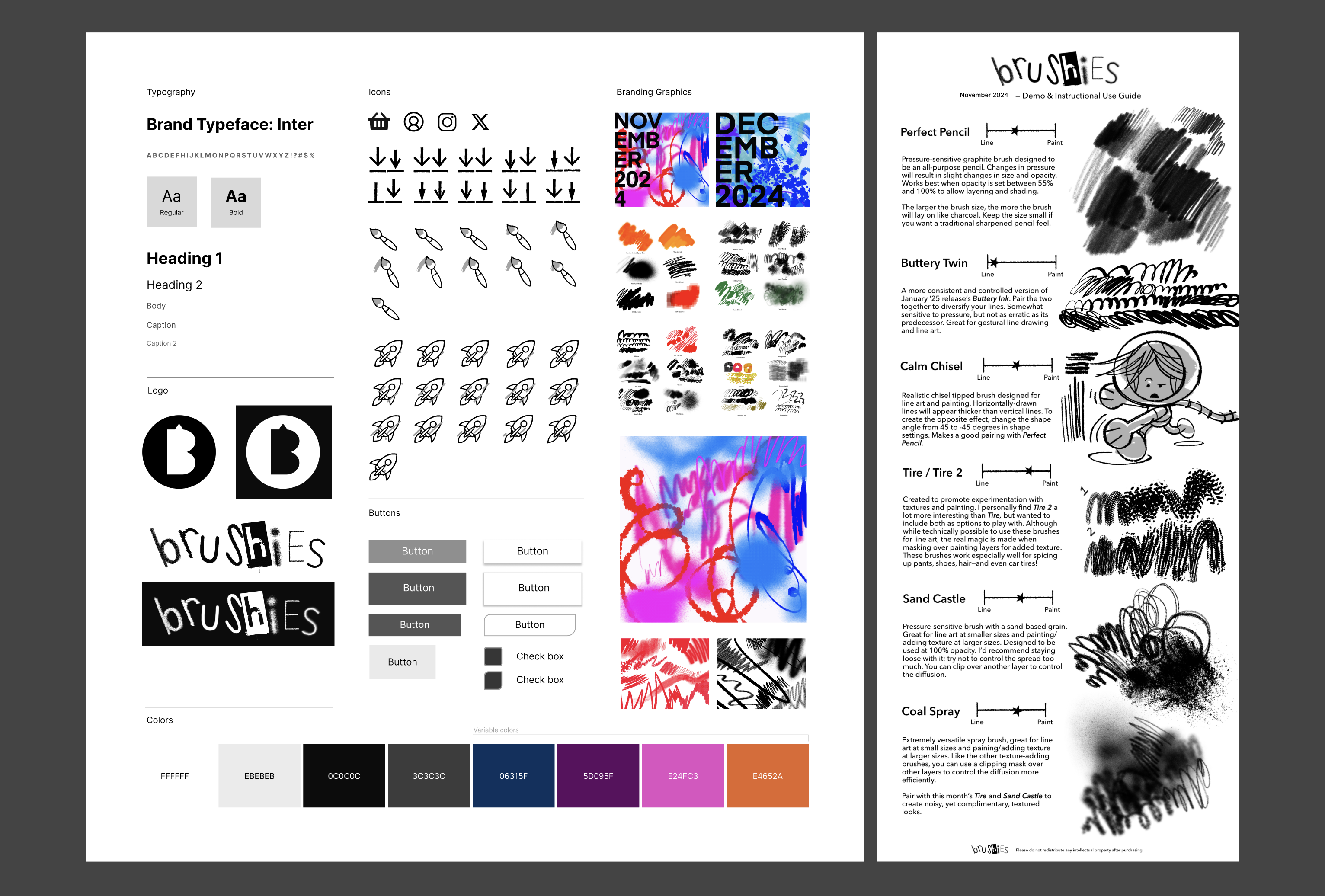
Revisions to color, typography, iconography, and imagery. The left figure depicts site design, while the right depicts layout of downloadable visual content.
4. Iterate
Usability Study, Pt. 2
Conducting a second moderated usability study to see how users interact with the new design iteration
In order to promote overall navigation and boost conversion rates, I needed a deeper understanding of the Brushies user base, considering key behaviors for both mobile and desktop visitors.
To achieve this, I conducted interviews with a diverse, representative group of digital artists. To better organize and analyze my findings, I synthesized the data into an affinity diagram using FigJam. Categorizing data this way helped me identify user patterns and pinpoint areas of the site that had significant room for improvement.